Showing posts with label Colour. Show all posts

Christmas colours of Sweden

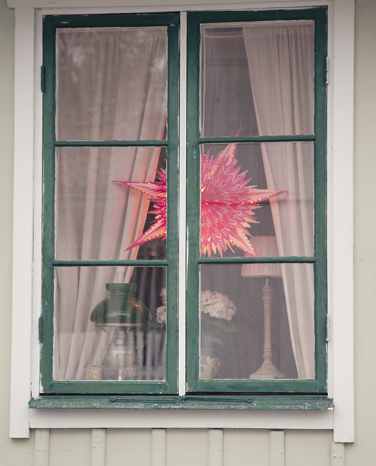
Sweden is such a beautiful country, yes sure it has it's industrial areas and shopping malls like everywhere but the houses are such a multitude of traditional and unusual colour combinations and at this time of year, when everyone has lights in the windows and on the porches, it is picture book perfect. 


Maybe because the houses are mostly wooden cladded this has led to the whole house needing paint but the array of different colours used makes for the most beautiful look.  There is of course, the traditional red houses with white and yellow windows but look at the details and you will see that there are other things coming into play here. Usually choosing two tones but sometimes with another added for highlighting details like the window frames.


Not only are all the windows decorated with lights and Yul objects, but there is also the tradition of having a candle lit outside our door to welcome guests.  All the shop owners do this and it makes for the most magical look.  

We visited our favourite Christmas market in Sigtuna, this is such a gorgeous place, set on a lake and one of the oldest towns in Sweden. The market is a mixture of handicrafts and food.


If you are wondering what this is above, well meet Tomte a Swedish house gnome which also replaces Santa in some houses, the cute little fellow has been given a new twist here, depicting him in greenery. This Tomten lives in the forest and likes to be fed porridge!

My bag came home full, with a mixture of old and new. I found lovely knitwear in my favourite shop called Indiska. Lovely quality fairisle style cardigans and some cups from their new range. I also managed to pick up some Swedish made wool while we were in Sigtuna and intend to knit some Nordic mittens in black and white. 

No trip would be complete without a good rummage in second hand shops and a large haul of old cake tins and some mini candlesticks ticked off more on my wish list. These will all feature over on my Instagram feed over the course of this month. 

I do of course bring home many of ideas and inspiration for lights and candles, my home will feature the classic candleabra lights in the front window, stars and wreaths and decorations made from Pepparkakor (gingerbread) and folliage.   I hope these photos will help to get you in the mood too.  

Styling The Seasons with Annie Sloan Wall Paint

Last year I was a 'painter in residence' for the chalk paint by Annie Sloan, before being chosen I had been using it for some time on walls, despite the fact that it was originally intended for furniture. For me it was a welcome change to traditional emulsion paint, giving a velvety matt surface.  The lack of sheen on the surface gives the colour more depth which changes throughout the day depending on the light. 

This however is not for everyone and is probably not ideal for areas of high wear or where water might splash. So now to fill that gap, Annie Sloan has developed a specific wall paint and this week I got to try it out.


My studio has wooden 'tongue & groove' panel walls, so in actuality I was painting over a standard emulsion on wood. This made the roller slip a bit so there is some slight patching, this would only take a few minutes to rectify and was down to the roller and not the paint.


I'm so familiar with the original chalk paint I find normal major brand paints very weird. Firstly, emulsion wall paint is so thin and splattery, needing several coats very often and the cheaper the paint the worse it is.  Secondly with wood paint Im allergic to the fumes and this was the major reason I changed to chalk paint in the first place.

The colour I've used here is Versailles, but please don't take these photos as a good representation of it, I was shooting in quite strange light and depending on your computer screen settings, the colour will not be precise.  For a truer colour look at the Annie Sloan site  and get tester pots, paint large areas of the walls you want and see how it looks in situ. I have seen Versailles look quite yellow in some light but in my studio it is a pale coffee beige. I wanted a neutral that seemed quite seasonal, matching the tones of changing leaves in nature. 


So how is this paint in comparison? Well, firstly I was really surprised with how thick it is, it must be the thickest wall paint on the market.  This I think would be particularly useful if you are painting a light colour over a dark colour, on the last photo I painted over a very dark blue chalk paint on the chimney breast and it covered it just fine. Also as I was painting onto a wall there was no slipping with the roller so its incredibly flat there.

I used a very cheap and very rubbish roller to apply the paint, just to put it through its paces.  It went on the wall a treat and while it didn't look 'even' when wet, it dried all one colour. 

The paint has a very slight silk finish so is suitable for wiping down or splashes of water but still matt enough not to be shiny.  
  
You can see the range here.  The coverage was good for a thick paint too and so if you are using the furniture paint you can find a wall colour that will work with it as Annie's paints sit very well together and she gives excellent tips about which ones sit alongside each other. 

While I'm here I would like to say a thank you also to stockist Dawn at Halcyon Days in Rye who very kindly gave me a tester of the wall paint in Duck Egg Blue, which I've used in a few photos now. I wandered into her shop when on holiday this year and we spent lots of time there chatting and laughing, she has some great vintage items too. 

The wreath on the chimney breast is now on its third or fourth incarnation. It was the one that I was given when we went to the 'Styling Spring At Mine" workshop.  It is now resplendent with dry hydrangea heads and I expect will get a bit of ivy and maybe even some holly nearer to Christmas.   

This wall paint has given me the bug again, I'm thinking about some other lighter colours now the natural daylight is disappearing. Also time soon to dig out the furry rugs and woolen throws. I've already started to light fires as there is a distinct nip in the air, and yet there are still roses on the bushes outside so it's an odd time to be sure.

Janice. 

1960's to 1970's looks and vibes

Wake up, its the swinging sixties and the groovy seventies and ORANGE has arrived!

There's so much that could be said about these two decades but I'm here to talk about colour and interior ideas so I shall try not to get side tracked and wander off down memory lane.

In 1964 Habitat was born and this was to shape the style of our interiors and create trends and desires for objects that were new and cool. Conran bought us the Duvet, paper lantern lampshades, the wok and the chicken brick. Here in the UK we now had our own trend leaders; Mary Quant gave us legs with her hot pants and mini skirts, modeled by Twiggy, Vidal Sassoon supplied the wedge bob hair style and everyone wanted to drive around in a new Mini car. The Brits were fashion leaders with The Beatles flying the flag for Brit style.

The patterns in wallpapers and fabrics were verging on the psychedelic, large rounded motifs in shades of orange, yellow, mustard and brown. During the 60's the department store Heals were commissioning some iconic designers like Peter Hall and Barbara Brown to produce fabrics with big stylised shapes in rich deep teals and emeralds. But it was orange that really hit big and if you want to replicate this era then its an absolute must to include. 


Habitat, not surprising considering its history, still do the best hues of orange, mustard and green in paint to replicate the sixties to seventies time. And they also still sell beautiful lampshades made of paper and have even reintroduced the chicken brick.

Another great place for getting items that fit the look is IKEA. During the sixties and seventies we began to see Scandinavian influences appear more and more, these shapes can still be found at our favourite Swedish superstore who have built their name on affordable design, primarily using wood which is a large resource in Sweden.   


There were some other colours apart from orange and brown, a sage green, olive is the best description and it was frequently used in excess, almost in saturation in some homes. If you find yourself some vintage Hornsea ware (kitchen jars and cups) then these colours give you the right idea.

A few years ago a friend and I made-over a bachelor pad in north London. The flat was in a building that was a design icon, the architect being Peter Tabori and built in the early seventies. So taking that as an influence we wanted to bring a bit of cosy and warmth to the owners rooms, adding fur rugs, pampas grass and voile curtains in cream and brown, while keeping to the building's era.


As we move into the seventies things tone down a bit, the colours become more muted and a reaction to all the plastic was a fashion for more natural materials like wicker and rattan. Brown and corduroy on clothes and furniture and a back to the earth approach came along with lots of house plants. Hessian even featured as a wall covering, and it was murder to remove!


I've made a pinterest board that features both authentic photos and current products that will help you pull this fab look together (double click for the link direct to the product). Homebase stock Habitat paint and their products are all available on line, some of their furniture is influenced by 70's designs like the Tisno chair. 

Other touches that will help you create an authentic look would be to add macrame either in wall hangings or plant holders. House plants took a real upturn in the seventies, possibly because now the exotic was traveling across borders. Ferns hanging from macrame holders, large Swiss Cheese plants were all essentials in the homes of that era.

As I mentioned before, the seventies also had some revival styles happening, Art Nouveau became popular, with Mucha's ladies appearing on mirrors.  

I shall be back to normal next week with the Styling The Seasons and Urban Jungle Bloggers photos, have a lovely week and keep your fingers crossed for me in the Amara Interior Blog Awards. 

Peace.

Style and colour of the 1940's and 1950's

Second in my series of decades and colours is the 1940's to 1950's. The reason Ive grouped two decades together in this series is that it's never clear cut from one decade to another where one style stops and another starts, so I'm going for a general overall impression of the colours that were popular during those eras and how to replicate that feel with modern paints and products.

Sadly the 1940s being a time of World War gives a hiatus to style and colour as utility and functionality took precedent over design and art for arts sake. Having said that, the events during that decade did shape the progress of inventions and practicalities in dress and homes.

The reaction to the end of that time of repression and rationing was the explosion of frivolity in the fifties. Clothing became more flamboyant and consumerism started in ernest.

The age of the slow Ocean Liner was surpassed by the age of Air travel, and the scientific and engineering progress which came about during the war was to influence designs in home accessories and fabric and print design.

Colours that stand out to me are pastels with pops of red. A primrose yellow, a special shade of blue and mint green that remind me of ice cream colours. Black and White checkered floors, and the 'atomic' shapes which came about after the Festival Of Britain.

Let's have a look at some films that will put us in the mood. The film industry was dominated by Alfred Hitchcock classics, Rear Window, North by Northwest, Strangers On A Train. James Dean, Audrey Hepburn were making their debuts and the film industry moved into colour in full glory.  America dominated the style, and in the UK we craved the American fashions.


Above in my own kitchen I decided to go retro with appliances because it was the best way to add colours. We all know that SMEG sell these glorious Fridge/Freezers in classic retro colours with handles reminiscent of old Fifties car door handles and that smooth sleek rounded corners of old American fridges. The fabric I've used to hide the washing machine is original fifties barkcloth. The background being pale grey with pops of red, blue yellow and green which were fashionable then. The little scenes are of European influence, like Italy and the Mediterranean, places that were now accessible.  


The room that is the easiest to style in these decades for me is the kitchen.  There's a fabulous array of items available from high street and online stores for appliances that scream American fifties. Have a look at online store Wayfair.co.uk for the clocks Ive featured and the 'petrol pump cd rack'. It's quite easy to buy kitchenalia from that period too, as the enamelware lasts forever!

Young couples like my parents wanted everything modern, Britain was rebuilding at a rapid rate and they had big aspirations. In kitchens the labour saving devices were king and surfaces were Formica in an array of new colours and patterns. The new transistor radio brought rock n roll and the teenager was born, having their own fashions for the first time, rebelling against their parents buttoned-up lives. 


During the 1940's there was still an abundance of floral motifs on walls, floors, curtains but as time moves on into the 1950's this changes into these more 'atomic' shapes and the abstract takes over.


I took this photo at Bletchley Park, this green was one of the few colours available during the war


There's a pinterst board featuring more of the forties and fifties over at this link https://www.pinterest.com/JaniceIssitt/1940s-to-1950s-home-styling/

Hope you find this useful if you are going for a vintage look, see you soon in the sixties and seventies. 


Coastal Art and Colours - Lewes to Rye

I thought I'd just do a little round up of my  latest trip to the coast with some recommendations of lovely grownup things to do if you are interested in art and interiors particularly.

We drove to Lewes as our first stop, which unfortunately didn't give us a very pleasant hotel experience, having left it a bit late to book we chose what seemed to be ok location wise but was a very run down and overpriced place. In fact the worst hotel on our trip and the most expensive, I won't name it but its a pub/inn on the high street.

The best part about this location was its proximity to three things we went to, firstly the Vintage Fair in Firle, then Monks House the former home of Virginia Woolf and then Charleston House, the home of Virginia's sister Vanessa Bell, an artist. Have you been watching the tv series about them "Life In Squares" - love in triangles. Its worth catching on iplayer to get the general feel of the stories behind this set of bohemians and is also filmed at these locations.


Monks House

The best part about Monks House for me is that you can take photos inside and their welcome to visitors is very warm. The green colour in the lounge was mixed for them by Farrow and Ball and is truly stunning. 


Monks House is not as decorative as Charleston but the garden is just as stunning and the collections inside are also lovely. 

Firle House vintage fair was glorious, mostly because we had a really sunny hot day.  I knew the traders would have great stock as lots of the vintage sellers from the south coast go across to France buying. Disaster number two came when my other half got stung by a wasp on the lip! we are calling it wasp gate. The traders there were so kind, they found him some medicine and remedies. Naturally I picked up a few cute things as souvenirs and then we headed down to the coast to Eastbourne. 


This stretch of the coast is classic British and really quite smart and clean. We booked a comfortable hotel on the beach front, one of the old Victorian buildings. Laying in bed listening to the sea and seagulls was so lovely. What else should you do there? well buy some fish and chips and eat them on the pier of course.


We didn't do so much in Eastbourne, just sat on the beach and collected shells, soaking up the sun and fresh air.

From there we tried to stick to a coast road and in my search for a nice cappuccino we stumbled across the De La Warr Pavillion which is showing an exhibition of Bridget Riley paintings. I have wanted to see her work up close for so many years, I couldn't believe it! The exhibition runs to the 6th September with information here http://www.dlwp.com/event/bridget-riley-the-curve-paintings the cafe was also very nice so that was a totally unexpected bonus. 

Style guru Jeska at Lobster and Swan gave me some recommendations for shops she thought I would like in Hastings and thank goodness she did as I don't think we would have found them. Theres an amazing selection of vintage shops in lovely old buildings in the old town near George Street. The High Street and Post Office Passage will keep you amused all day exploring if you like a rummage. Butlers Emporium was recommended to me and it is really beautifully curated. I bought a few lovely things which will be featuring in my photos soon. We ate in Nazar a Turkish restaurant with very good food, its on Robertson Passage. We love lots of 'picky bits' so a Meze is perfect for us, me who grazes and the other half who eats like a horse. 

It was quite sad to say goodbye to Hastings, I could have done with another day there but Dungeness was calling. Since I worked at Mute Records with musicians who put music to Derek Jarman's films, I have wanted to visit his cottage and garden. It is so lucky for us that it is still possible to just drive up to the cottage and wander round, but please respect the occupiers. The cottage is called Prospect Cottage and you can see its location on google maps.


I read that Derek Jarman chose the yellow of the windows to reflect the yellow in the plants which grow there. Please do some research before you go so that you can better understand about the planting and how the garden grew into an art work organically.

We lost the good weather but somehow grey and dreary does really suit the area of Dungeness, a truly strange place.  Theres a toy train which the school children still catch, but we didn't actually ride on it ourselves. 


Our hotel in Rye was such a joy after a windy drizzly day. Perfectly located and with lovely decoration, the Hope Anchor was great value for money with very good breakfasts. Just round the corner from great shops and beautiful old winding cobbled streets. Mermaid Street has been used in so many films, transporting you back with buildings from the 1400's.  The Mermaid Inn is on my bucket list of places to stay, maybe next time, its one of Englands oldest Inns having been rebuilt in 1420.  

The George and The Standard are great places to eat, but you need to book. A lovely combination of interior design shops and antiques. It is good for mens clothes which is unusual. Rye is definitely another place to go back to and quite magical.

Tomorrow I pop over to Amsterdam to visit an old friend. Rosey is a very stylish girl and Im sure I will have some lovely photos of her cool house to share.  Have a lovely weekend everyone, and please don't forget to vote for me in the Amara Awards the link is here :
http://www.interiorblogawards.com/vote/janice-issitt-life-style/

Your support is really appreciated. 

Amara Interior Blog Awards #IBA15

I can't quite believe that Ive got through to the next round of voting for an #IBA15 in the colour inspiration category. This journey of blogging came quite by accident and at a time when I really didn't think it would lead to anything.

Initially I started blogging as a place to put my photos both of my home improvements and places discovered around where I had just moved to.

It seems that whilst all around are favouring the black and white, or all white minimal home styling (which I do love and admire), I simply can't do it myself. I love collecting, family heirlooms, bits of memorabilia, just lovely stuff. I find it comforting and inspiring, my brain just seems to respond to colour and maximalism. 

So this is me asking please, that if you like any part of what I do, to vote for me in the Amara Interior Blog Awards. Im pleased that this company are sponsoring such a thing as I often purchase from them.  While I like old, there are some things that just have to be new like bedding, kitchen stuff etc.  Also its good to support clever new designers like Pip Studio and the more established companies who respond to current trends and styles (Im so pleased the fashion for white 'white goods' is over, all hail the retro styles and colours of kitchen appliances. 

Voting in the Awards starts on Monday 10th August at http://www.interiorblogawards.com/ 


This weekend Im travelling along the coast, my previous post just got me in the mood, so I told the other half, I want to see the coast and I want to see it now. 

We are fitting in some cultural stuff too, like Virginia Woolfs house, (Monks House) which I will talk more about soon. But to my surprise the lounge had walls the same colour as Ive just been painting in my kitchen. I was told that Farrow & Ball had mixed this colour especially, it is called Monks House or something similar, I will look into it more. 


Also the seaside heralded some great colours and atmosphere, the sky was so blue, it was a really hot day, the first for ages, so it made the rather horrendous car journey all worthwhile. 


All the best for now, love Janice.